
Is your company a future hunter or prey? What might this mean to your brand?

“Historically, the decision on how to merge two large companies' brand identities and logos seems to have been made haphazardly,” write Ellen Sluder and Neil Wieloch of consulting firm CoreBrand. “Rarely do companies take the time to consider how to [re-brand] most effectively.”
In a Harvard Business Review article, Jonathan Knowles, Isaac Dinner, and Natalie Mizik recently showed that companies that “fuse” their two logos perform better financially than mergers in which one partner’s identity is discarded or both partners’ logos are maintained separately. So it’s better to be a logo united than one divided.

Speaking of united, many branding experts criticized the logo that resulted from last year’s merger of United Airlines and Continental Airlines. The new company kept United’s name and a very similar font, along with Continental’s blue globe icon. Basically nothing changed, and an opportunity to showcase a new, stronger airline was lost. Supporters claimed that changing signage at hundreds of airports all over the world and repainting two fleets of planes would cost millions of dollars. But what if the change was phased in? And how much money is the new, boring brand losing for the airline? Did the leadership examine all the options before they decided not to change anything?

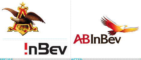
I also like the new AB InBev logo. It updates the 130-year-old Anheuser-Busch image and tones down the futuristic InBev font to create a new look that’s both classic and forward-looking.

URLpulse compiled a gallery of “before and after” images of merger logos. It’s clear right away which companies tested and evaluated their new branding and which ones didn’t give it much thought.
Speaking of united, many branding experts criticized the logo that resulted from last year’s merger of United Airlines and Continental Airlines. The new company kept United’s name and a very similar font, along with Continental’s blue globe icon. Basically nothing changed, and an opportunity to showcase a new, stronger airline was lost. Supporters claimed that changing signage at hundreds of airports all over the world and repainting two fleets of planes would cost millions of dollars. But what if the change was phased in? And how much money is the new, boring brand losing for the airline? Did the leadership examine all the options before they decided not to change anything?
Take it from the expert. Brandemix Creative Director Clarissa Zorr weighs in based on her own experience with merger logo design. “The brand design should take into consideration the reasons for the merger and what the new brand will stand for,” she told me. “Is it a paradigm shift, a hostile takeover, or are they simply joining forces?”
Good advice. So what are the “fused” logos that get it right? Verizon comes to mind. It’s the result of Bell Atlantic acquiring GTE. But you don’t see either of those companies’ logos, colors, or typefaces. The new company positioned itself as a 21st-century high-tech innovator totally unlike its old-fashioned parents.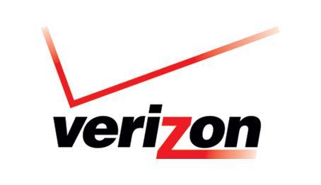


The takeaway? Never overlook your branding. As Zorr says: “Time, budget, PR, and overall marketing efforts all play a role in the decision-making process.” A merger or acquisition can be exciting, tense, or even confusing for employees. Make sure they have a strong brand behind them and you’ll be on the path to success.
If you’re interesting re-branding your organization, talk to us. Been through a recent M&A? we’d love to hear from you.
No comments:
Post a Comment
Note: Only a member of this blog may post a comment.